Friday, March 23, 2012

ournal #4 Drawings, Charts, and Graphs 


  1. Caption


  1. Textual citation or reference to table or figure


  1. Table with text or numbers


  1. Flow chart or process diagram


  1. Organizational chart


  1. Conceptual diagram


  1. Framing with lines or boxes


  1. Bar graph G


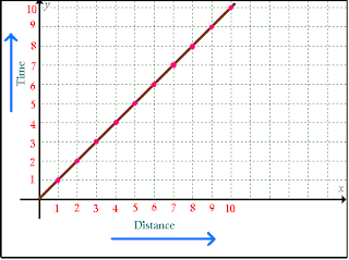
  1. Line graph G


  1. Pie chart G

  1. Pictograph G

  1. Ineffective graph (wrong type of information) G

  1. Chart junk or unethical graphic G

  1. Line drawing G

  1. Drawing using call-outs G

  1. Exploded view, cross section or blow up   G

  1. Lines or images representing motion G

  1. Lines or images representing boundaries or divisions G

  1. Lines or images representing texture G  

  1. Silhouette G

Thursday, March 22, 2012

Journal #3 Layout

1.       Good use of white space   


2.      Poor use of white space 


3.      Portrait orientation             


4.      Landscape orientation                    


5.      Single column grid                  
                                                           

6.      Double or triple column grid


7.      Mixed column grid  
                                                                          

8.      Heading flush with the text


9.      Marginal heading


10.  Numbers or letters used for a list       
                                                

11.  Bullet, arrow, or other highlighting cue       


12.  Drop cap (initial character takes up more than one line)


13.  Good ordering of information (showing relationship)


14.  Poor ordering of information (no relationship or emphasis)   (I googled this because I couldn't find it in my own life at all)


15.  Citation style (i.e., MLA) or other visual convention


16.  Title and section head


17.  Tabs or dividers


18.  Headers or footers     


19.  Background/watermark


20.  Frame using solid or dotted lines
                                                       

Sunday, March 11, 2012

Journal #2 Assignment

This blog post is for an assignment for my Visual Rhetoric class. In this post I will be reviewing the "Typography" of images I see everyday. The main subjects that I will be looking at will be


1.      Effective choice of typography                                                         
2.      Ineffective choice of typography                                                      
3.      Serif typeface                                                                                     
4.            Sans serif typeface                                                                                      
5.            Script typeface                                                                                            
6.      Novelty/iconic                                                                                    
7.      12-14 pt. size typeface used for the body of a text                           
8.      14+ pt. size typeface used for headings or display                            
9.      Italic type                                                                                           
10.  Boldface type                                                                                    
11.  All caps (All characters are equal in size)                                          
12.  Small caps (Initial character is larger than the others)                       
13.  Outline or shadow typeface                                                               
14.  Reverse type (white or colored text on black)                                   
15.  Colored type                                                                                      
16.  Kerning of capital letter                                                                     
17.  Appropriate line spacing (leading)                                                     
18.  Inappropriate line spacing (leading)                                                   
19.  Left justification with right justified margin (full justification)        
20.  Left justification with ragged right margin                                       
21.  Center justification                                                                            
22.  Right justification                                                                              
23.  Bad spacing between words (“rivers” or spaces between words)     □
24.  Subscript, superscript, trademark or other symbol                             
25.  Pull quote                                                                                            G


1.      Effective choice of typography   


2.      Ineffective choice of typography         


3.      Serif typeface 


4.            Sans serif typeface                       


5.            Script typeface       


6.      Novelty/iconic                          

                                                           
7.      12-14 pt. size typeface used for the body of a text      


8.      14+ pt. size typeface used for headings or display              

              
9.      Italic type            (The Magazine title is Italic)


10.  Boldface type                  

                                                                   
11.  All caps (All characters are equal in size)         


12.  Small caps (Initial character is larger than the others) 


13.  Outline or shadow typeface           


14.  Reverse type (white or colored text on black)      


15.  Colored type       


16.  Kerning of capital letter      


17.  Appropriate line spacing (leading)   


18.  Inappropriate line spacing (leading)        


19.  Left justification with right justified margin (full justification)   


20.  Left justification with ragged right margin    


21.  Center justification             

                                                              
22.  Right justification                

                                                              
23.  Bad spacing between words (“rivers” or spaces between words)    

-I couldn't help but use this picture because I thought it funny and it applied, Ill redo if necessary
-I googled this one as well because it wasn't easy to find an example of this in my life


24.  Subscript, superscript, trademark or other symbol  


25.  Pull quote